A Picture’s Worth 1,000 Keywords: Easy Ways to Use Custom Graphics Today to Boost Your Search Engine Rankings
Okay, your images aren’t really worth 1,000 keywords (unless you go viral). But, images can contribute to higher rankings and help your audience get more out of your content if done right.
When I first began incorporating graphics into my content marketing efforts, I nabbed a few free photos from Pixabay to add a little visual interest and went on my merry way.
As I gained more experience in helping clients create content that offered value to their prospective customers, I began dabbling with developing custom graphics. I made simple visuals and named them something appropriate.
What I noticed was that custom graphics helped content rank better on Google.
It wasn’t until a few years into my freelancing career that I learned that Google prefers custom graphics over stock photos. And, Google uses the name (or alt tag) that you give your graphic to understand what it’s about so that it can pair your graphic with relevant search queries.
As Google adds juice to its image searching capabilities (and rewards relevant images with higher rankings), creating custom graphics is becoming more and more essential for successful content.
It also helps your audience understand your content better (which, in my opinion, is more important than moving up a few notches on Google).
The good news is that there are multiple ways to use graphics to give your content some spice—below are just a few (with accompanying examples) that I’ve used with success for my clients.
1. Organize Concepts
I wrote an article about owned, earned, and paid media earlier this year for a client that’s begun to climb in rankings for keywords related to healthcare content marketing.
The concept of each channel isn’t complicated but, at least in my mind, things begin to get a little muddled when I think about the channels’ relationship (like amplifying owned content across paid channels).
So I made a little chart to support the point that each type of media plays a role in getting content before the right audience.
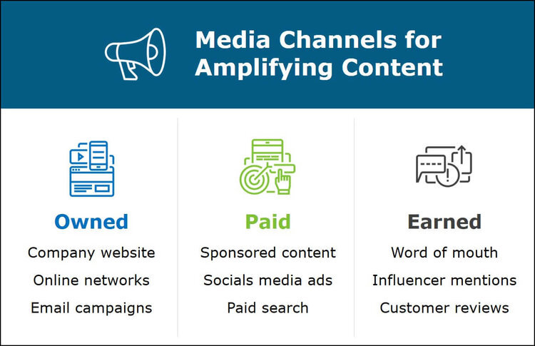
This isn’t exactly the most complicated graphic in the world, but it does its job by organizing information into a quick, easy-to-understand format. It also gives Google a custom image with a relevant alt tag.
This post has accounted for about 4% of organic traffic since it was published 6 months ago. That’s not bad for one article among dozens.
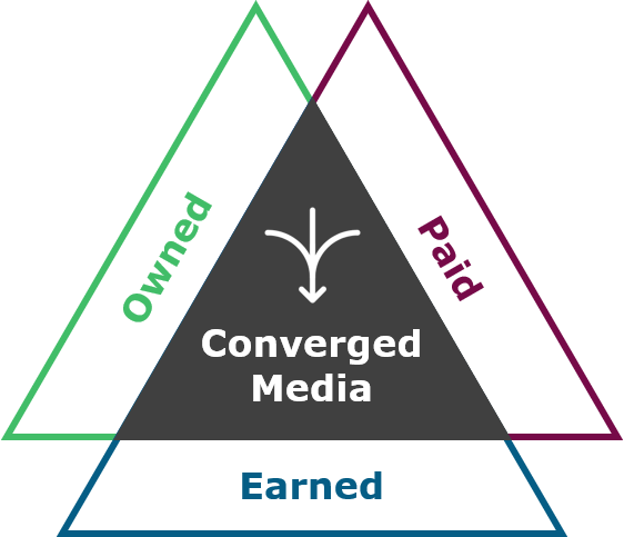
2. Illustrate Ideas
In the same article I mentioned above on content channels, the takeaway was that a converged media approach is the more effective at reaching a target audience and converting them into customers than any one strategy alone.
This graphic drives home the idea simply but powerfully: the most impactful strategy combines owned, earned, and paid media.
For a different but related article, I decided to take things a step further and combine the types of channels with converged media:
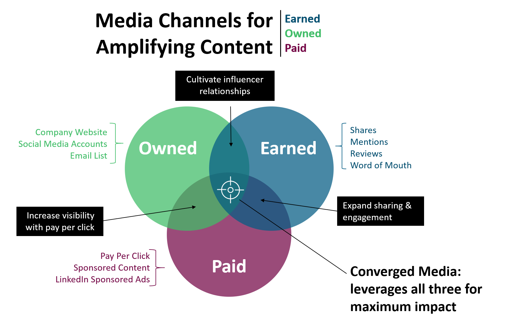
Inspired by Titan Growth
Though this graphic is a bit more involved than the other two, it demonstrates the relationship of the different types of channels and how they work together to amplify content.
I’d love to claim total credit for this particular piece, but I got a few ideas from Google to help me capture the essence of how these channels relate to each other.
When planning content, I use this chart to help me conceptualize where in the larger strategy new pieces fit.
3. Summarize Information
Another way to use visuals to support your content is to summarize information.
This table hits the highlights of an article that’s in the same vein as the ones above: publishing strategies for healthcare consulting companies.
The article itself thoroughly explores each of the main points in the graphic below (i.e. it was long), but a visitor can get the main gist pretty quickly by taking a few seconds to look at the graphic.
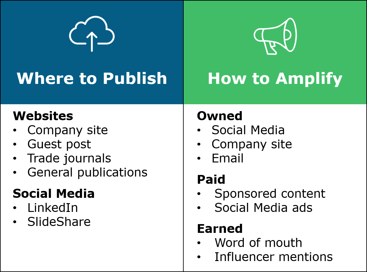
What I love about graphics like this is that it’s helpful enough that visitors might download it for later reference.
It’s also something that could be reworked to become part of a lead-gen resource for prospective clients.
Even if you don’t have a long post or something with a lot of detail in it, adding a mostly text-based graphic at the end of a post that hits the high points is a way to help your audience stay on track and add a little visual interest.
4. Visualize Data
Using graphics to communicate data is a not only a burgeoning field, it’s a great way to help your audience digest a lot of info at once and identify trends or divergences that might have gone unnoticed.
The fictional example below lists sales trends for 2016. While looking at the raw data, it’s relatively easy to note that international sales were lower than domestic. But other patterns or outliers are overwhelmed by the table’s level of details.
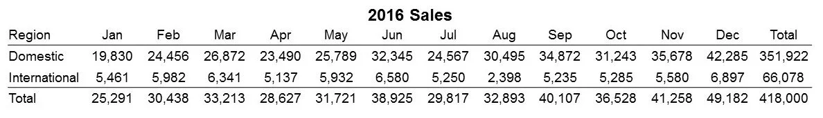
When the same information is presented as a line chart, it’s immediately clear how much domestic sales exceed international ones.
An upward trend in domestic sales is also revealed as is a relatively flat trend for international sales.
Outliers, divergences, and other critical information emerge when data is visualized.
The example below very clearly demonstrates the power of graphics to communicate with your audience.

The sign communicates a lot of information quickly and efficiently, tapping into the brain’s ability to process visuals faster than text.
By helping your audience better understand the data you present, you’ll support your main point and write more effective content.
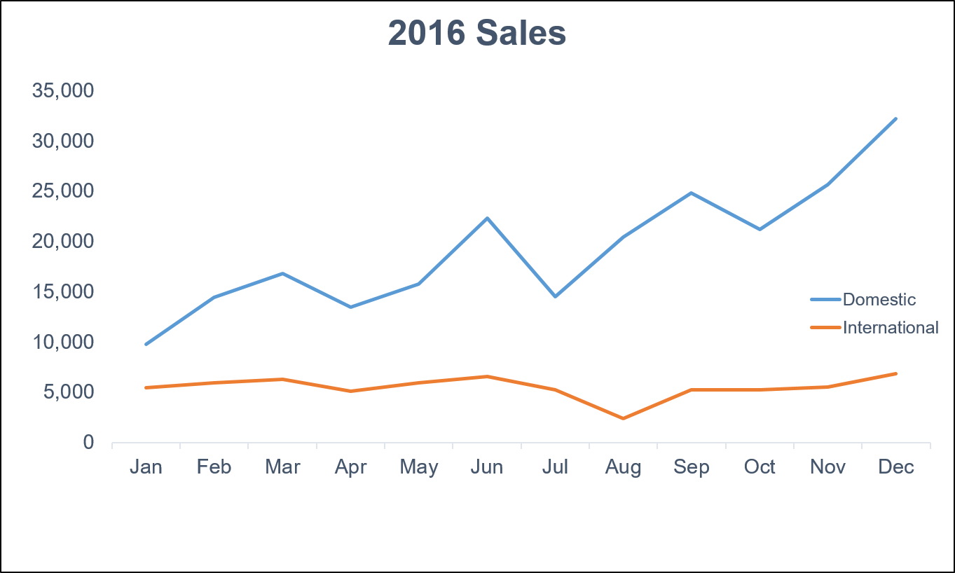
5. Tell a Story
Storytelling has become a hot-button topic among content marketers as an effective way for drawing in your audience.
The right graphics can support your story (or to tell a story on their own). That’s why infographics and memes and gifs (and pics of chonky cats) are popular.
Take, for instance, this image. To communicate how I use different content pieces to reach different buyer personas, I pulled a few graphics and screenshots from material I’d developed over the years (any of them look familiar?) and paired them with job titles of prospective clients.
The story this graphic is the strategy used to target specific personas and how that strategy can be applied on behalf of prospective clients to reach their audience.
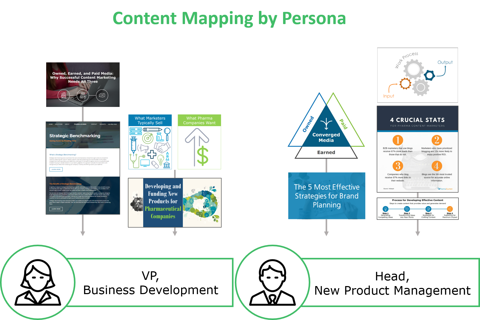
Here’s another example I used to support a story. In this article, the main point was that prospective clients don’t care about features, they care about benefits. They care about what’s in it for them when they work with you, so selling effectively requires being able to communicate what they get out of working with you.
This graphic shows the difference between what marketers typically emphasize (all the features, bells and whistles, and shiny parts of their product/service) and what prospective clients actually care about: how your product will increase their revenue.
A picture might not be worth 1,000 keywords…
But integrating custom graphics into your content improves rankings and helps your audience better understand what you’re trying to convey.
As you’ve seen from the examples in this article, what you create doesn’t have to be complicated or detailed. You can make something as simple as a line chart while still providing value for your target audience.
And, ultimately, the whole point of content marketing is to give your audience something meaningful that encourages them to work with you. Using custom images moves you closer to that goal.